Sometimes we want to visualize multiple data distributions in a 2D scatter plot. However, the points of different distributions can overlap a lot or even hide each other. To visualize the distributions more clearly and get a better understanding of our data, we can use confidence ellipses.
Confidence ellipses summarize the main information of a dataset using only four parameters: center, width, height, and angle. The center of the ellipse can be calculated using the mean of the data. The width and height can be determined based on the number of standard deviations from the mean, while the angle can be computed using the covariance matrix of the data.
Technically, to implement a confidence ellipse, we can first create a simple ellipse and then transform it using 2D affine transformations, such as scaling, rotation, and translation.
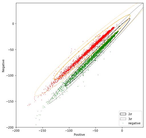
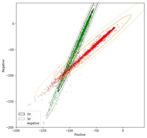
In the images below, we can see two distributions from a sentiment analysis project: positive and negative sentences. We can plot a confidence ellipse around each distribution to make the overall structure easier to understand.
In this example, the distributions are relatively easy to grasp even without the ellipses, but this is not always the case. When distributions overlap heavily or contain many data points, confidence ellipses can provide a simple and effective way to visualize their shape, spread, and orientation.